Make A TCG Game Card for a Card Game Design with Dextrous
We see a lot of new designers wanting to make their own Collectable Card Game (CCG) or Trading Card Game (TCG) inspired by classics like Magic the Gathering, Yu-gi-oh, Pokemon, Hearthstone or Keyforge etc. In this tutorial, you'll learn how to make your own TCG card layout in Dextrous by making a classic creature battler game card design a bit like something you might see in one of these kinds of games.
Before you can get your prototype deck of cards to the table though, you want to make a layout template for your game cards. This is where card game design software like Dextrous comes in handy, because it's specifically designed to be great for prototyping.
But we know learning any graphic design program can be daunting, and not all of us are graphic designers - so we wanted to make something you could follow along step by step and learn some best practices along the way.
Let's jump right in.
Custom Card Game Layout - A very good place to start
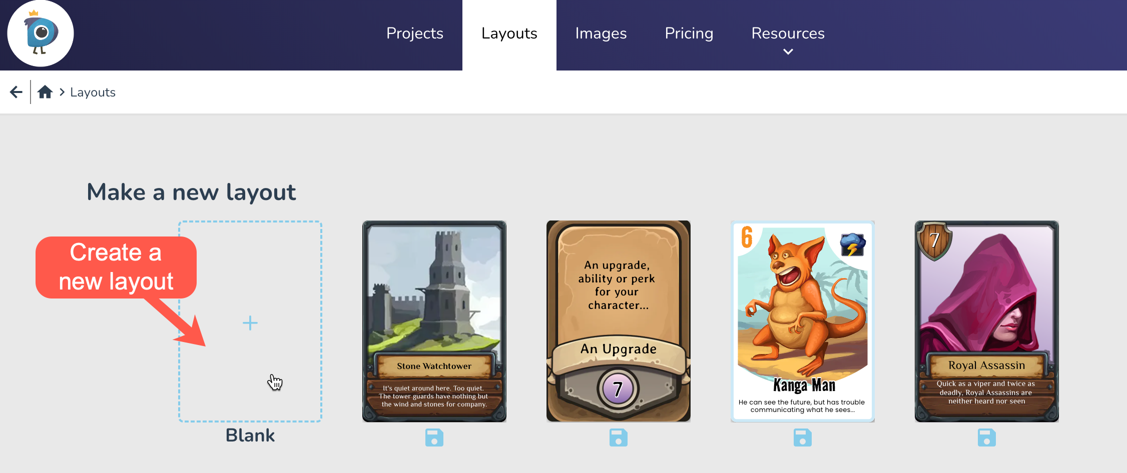
First up we need to make a new layout template. Click on Layouts in the top bar and select the Blank card to get started.
Card size - the size every card in the game deck
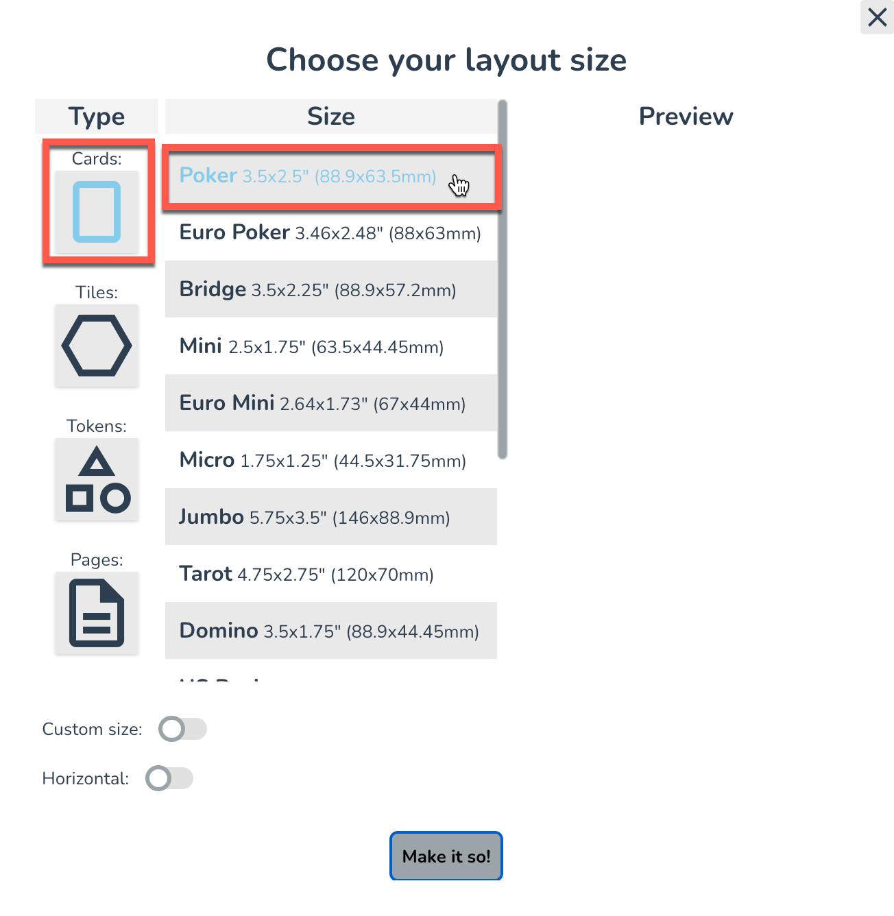
In the popup, you'll be prompted to choose the size of the Layout you want to make. The most popular card size tends to be Poker sized cards, (standard playing card size of 2.5 x 3.5 inches) so go ahead and choose the default Poker option for the card's size.
The Layout Editor - For Designing Your Custom Game Card
Welcome to the Layout Editor! Here you can edit the visuals of your card design. Tip: Try zooming in (using +/- keys) until your card takes up most of the space.
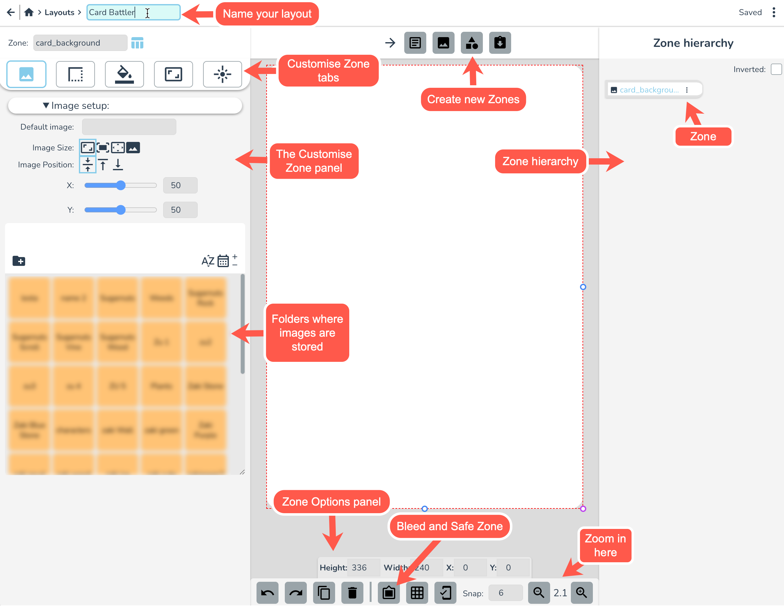
Let's start by giving your layout a name (top left). I'm calling mine "Card Battler".
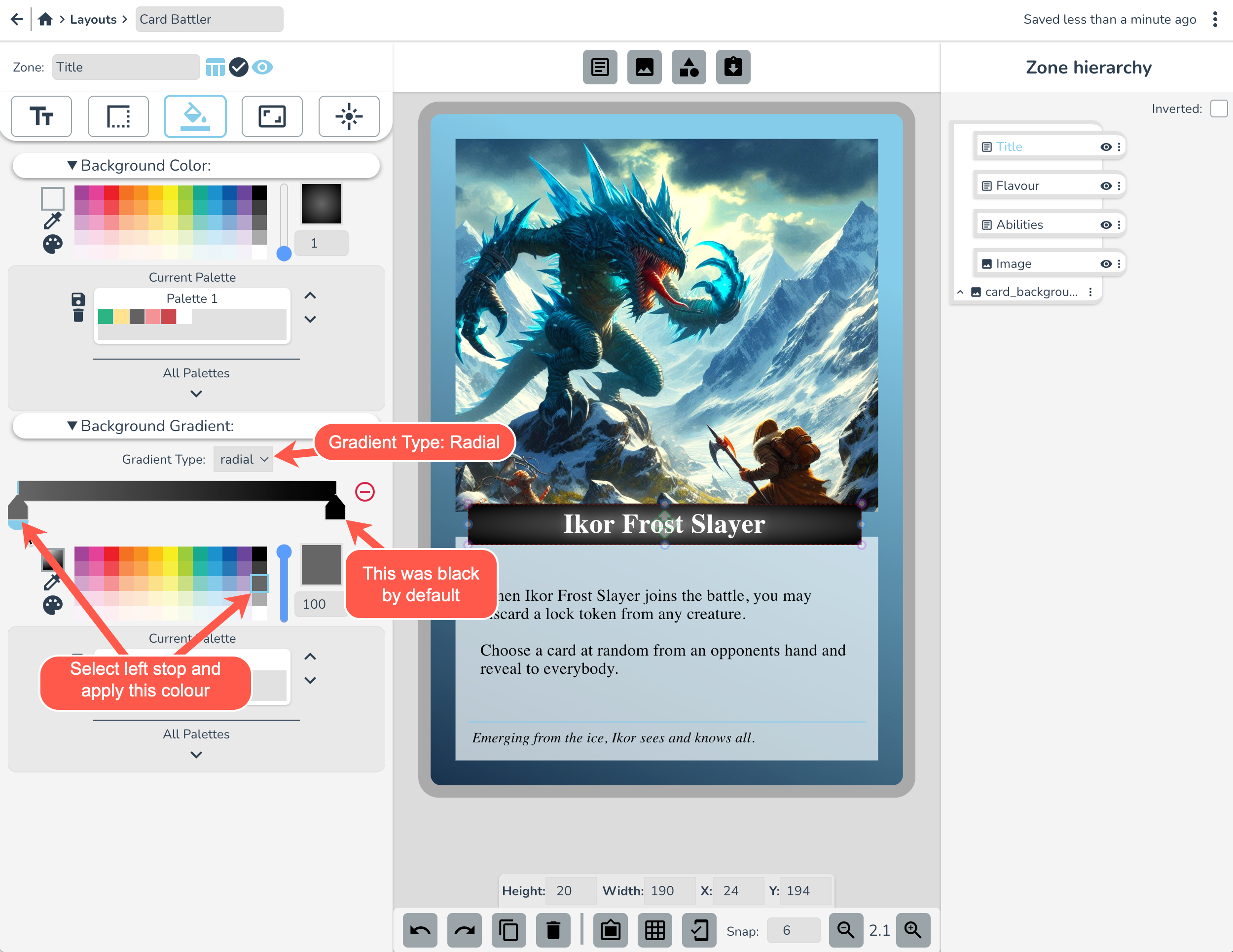
The Card Border
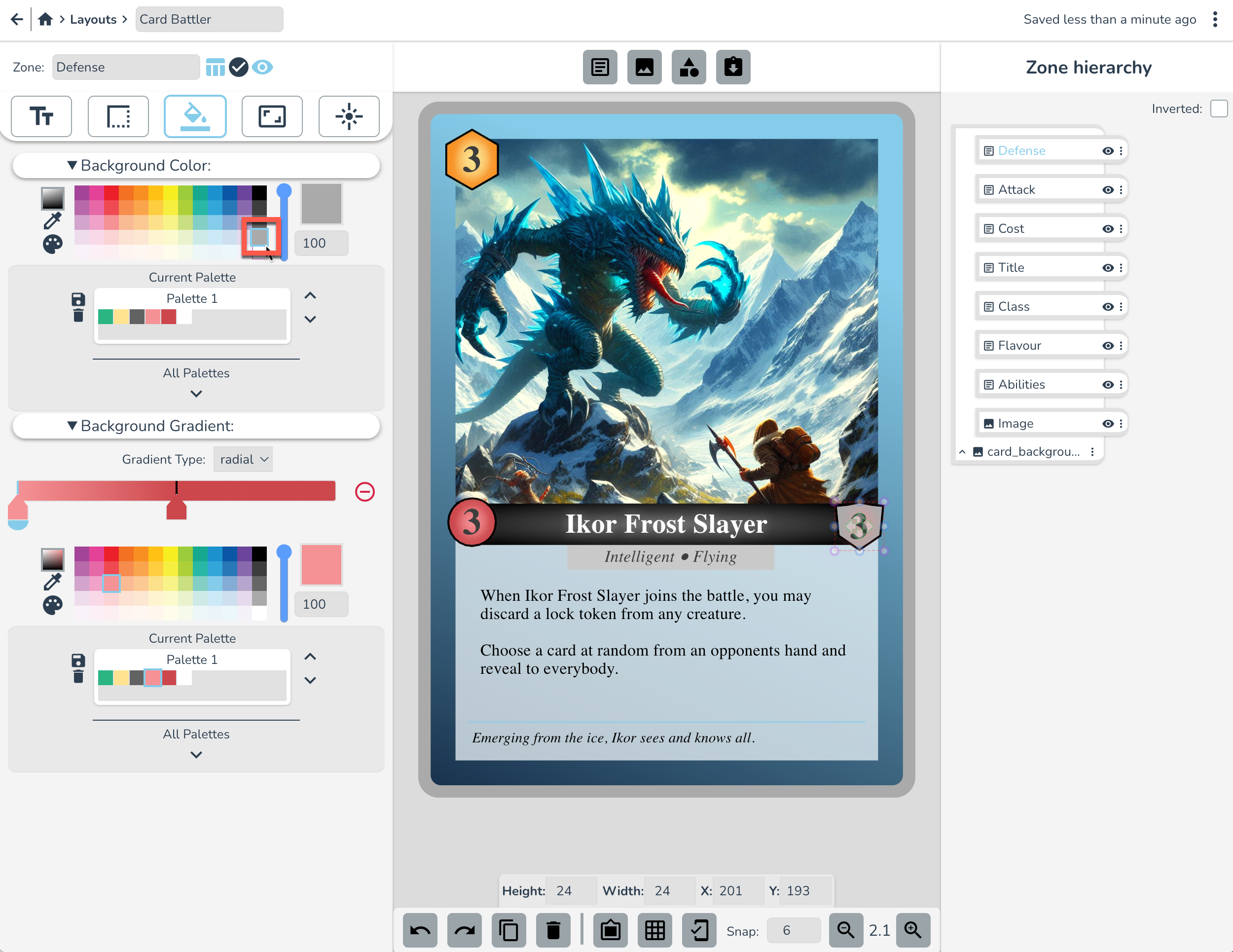
Now let's set up the border of this card. With the card_background zone selected, go to the background tab on the left. For the background colour, select the shade of grey indicated below or double click on the Colour Picker and paste in this: rgba(170, 170, 170, 1)
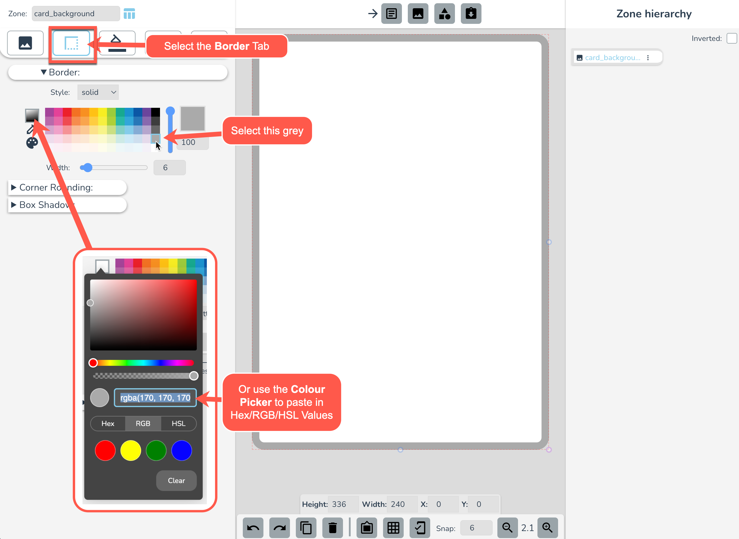
If you want the corners to be rounded more or less, you can open up Corner Rounding and change the settings there.
Next, go to the background tab, and select Background Gradient.
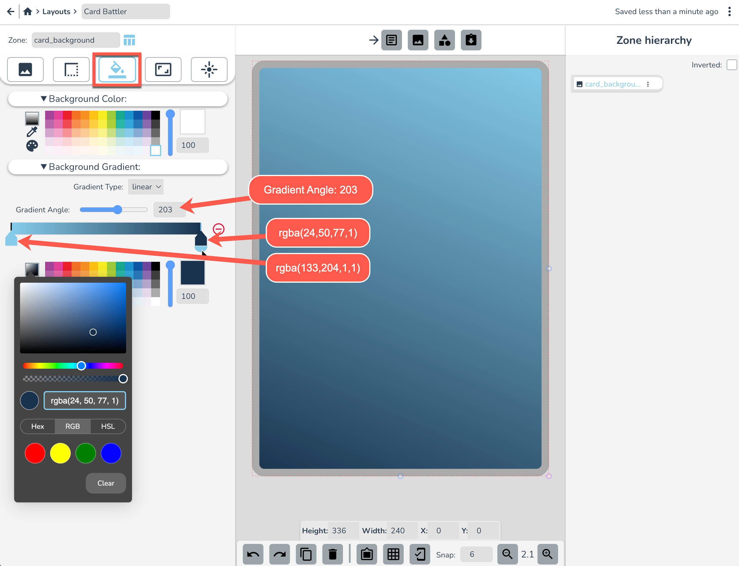
- Set the Left side stop to
rgba(133, 204, 234, 1)and the Right side stop torgba(24, 50, 77, 1) - (Optional) Bring the Left side stop in by about 1/5th
- Change Gradient Angle to 203
Image zones and image files
Make an Image Zone by selecting in the Create Zones section (top center). Rename this zone “Image”.
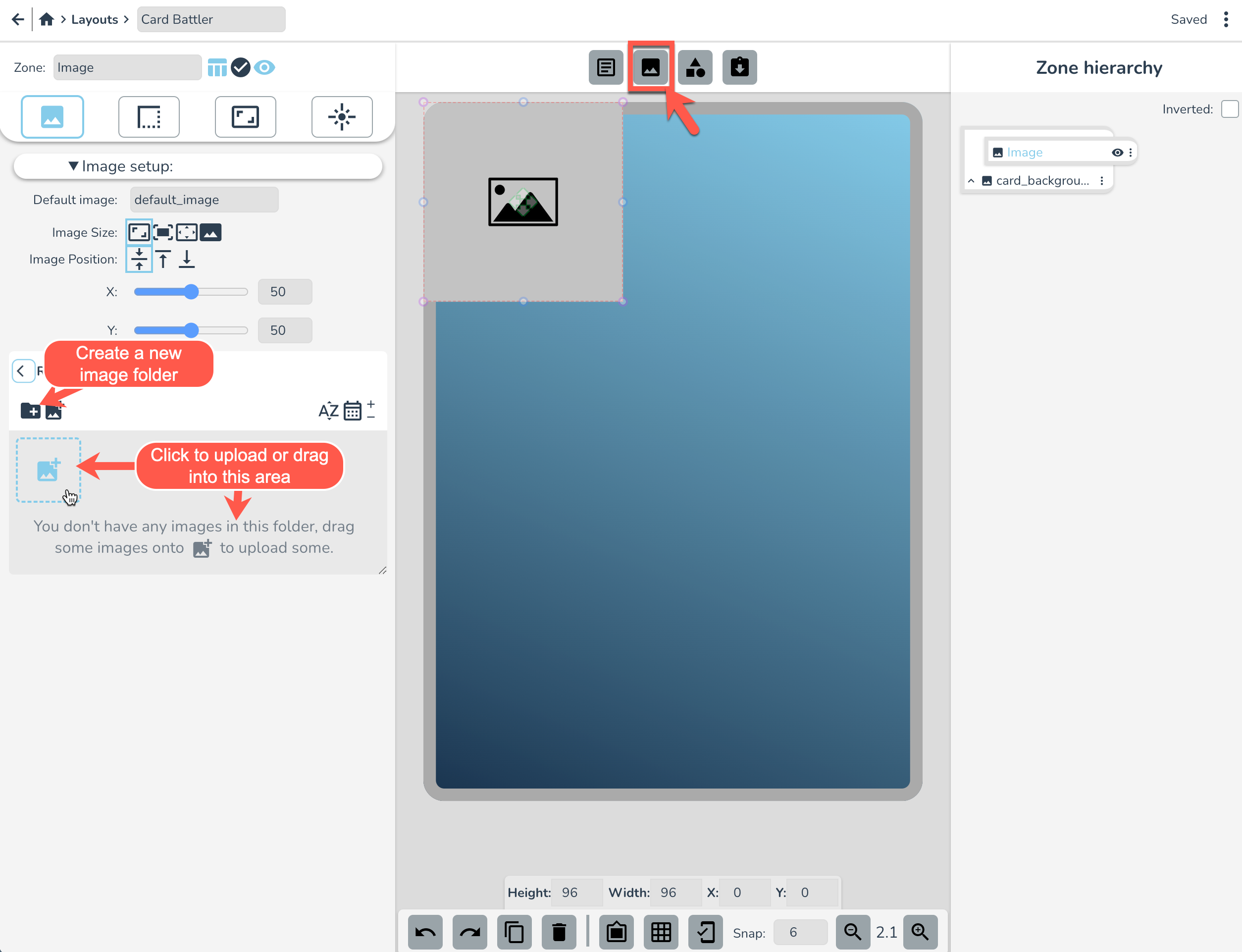
See the image panel on the left there? We'll use it to upload some images to use in this project.
Select the + folder icon to create a new image subfolder. Click the folder to rename it and call it “Card Battler”. Double click to enter your new folder and click the + image icon to upload images. For this tutorial we're just using a random AI generated image you can download here.
Tip: You can drag images into this folder straight from your desktop to upload them. Also, while images are uploading you can close the popup dialogue. They will keep uploading in the background.
Now it's time to resize and position our image zone. Let's make it take up roughly the top half of the card like this:
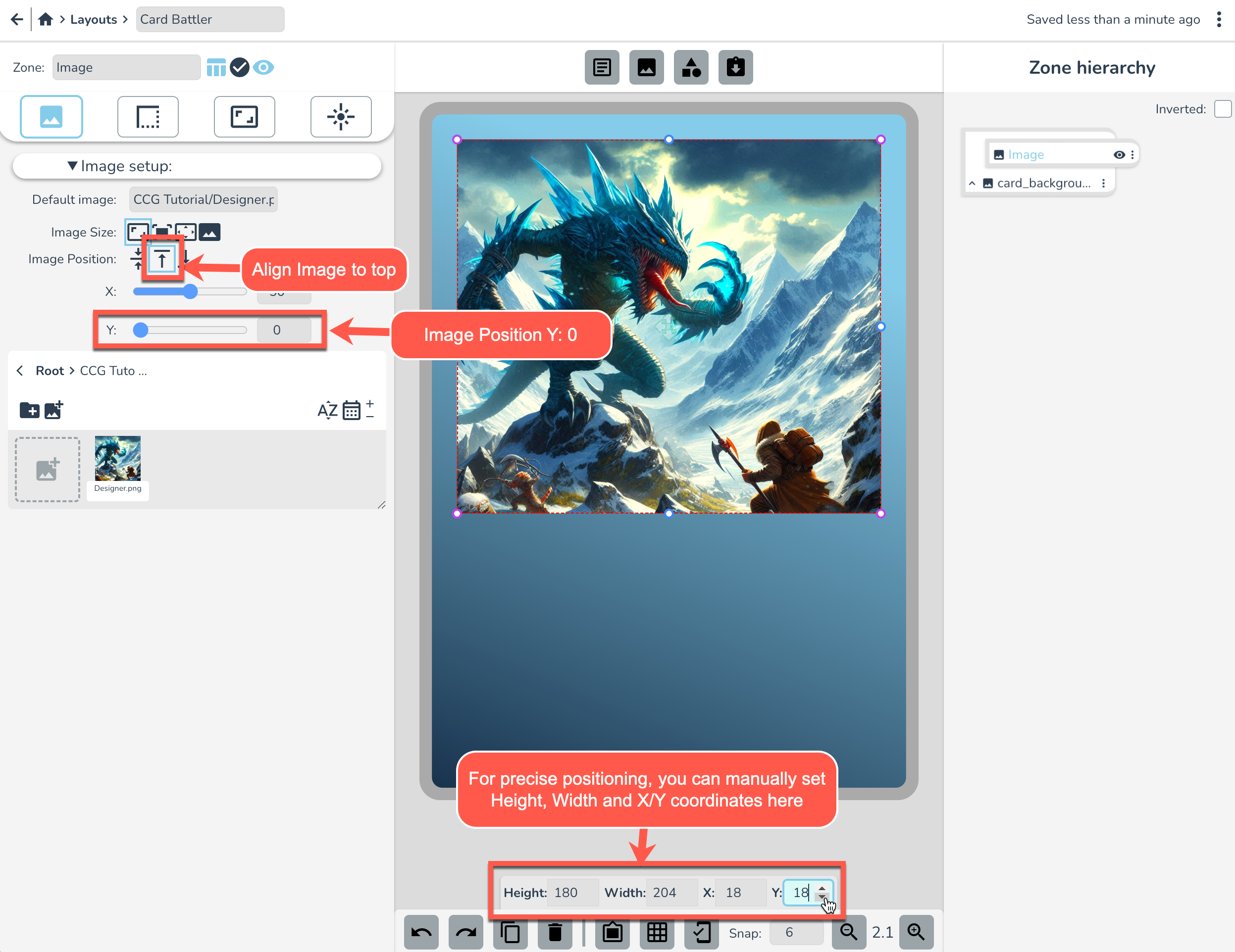
Remember, you can resize and move a zone by clicking and dragging or manually setting the following in the zone properties panel:
- Height: 180
- Width: 204
- X: 18
- Y: 18
Let's also align the Image to the Top and Set Image Position Y to 0 as pictured above. This will change where the image sits in the frame.
Tip: if you ever want to be more precise with zone movement, you can use ctrl+arrow keys to move by pixel.
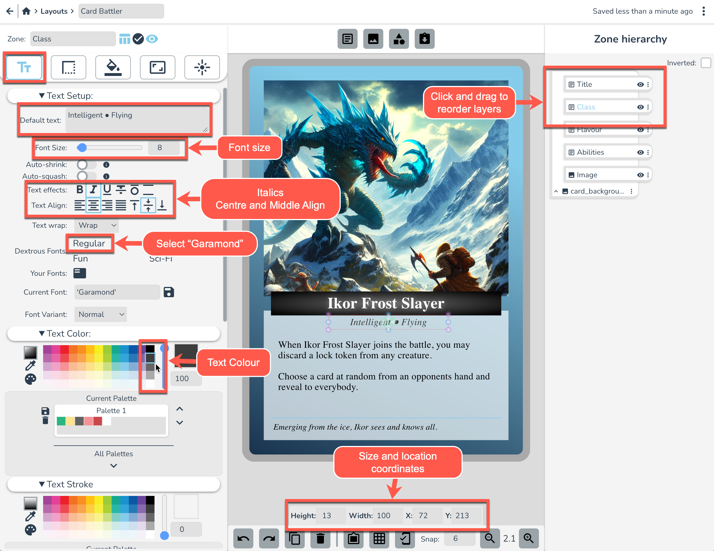
Main abilities text zone
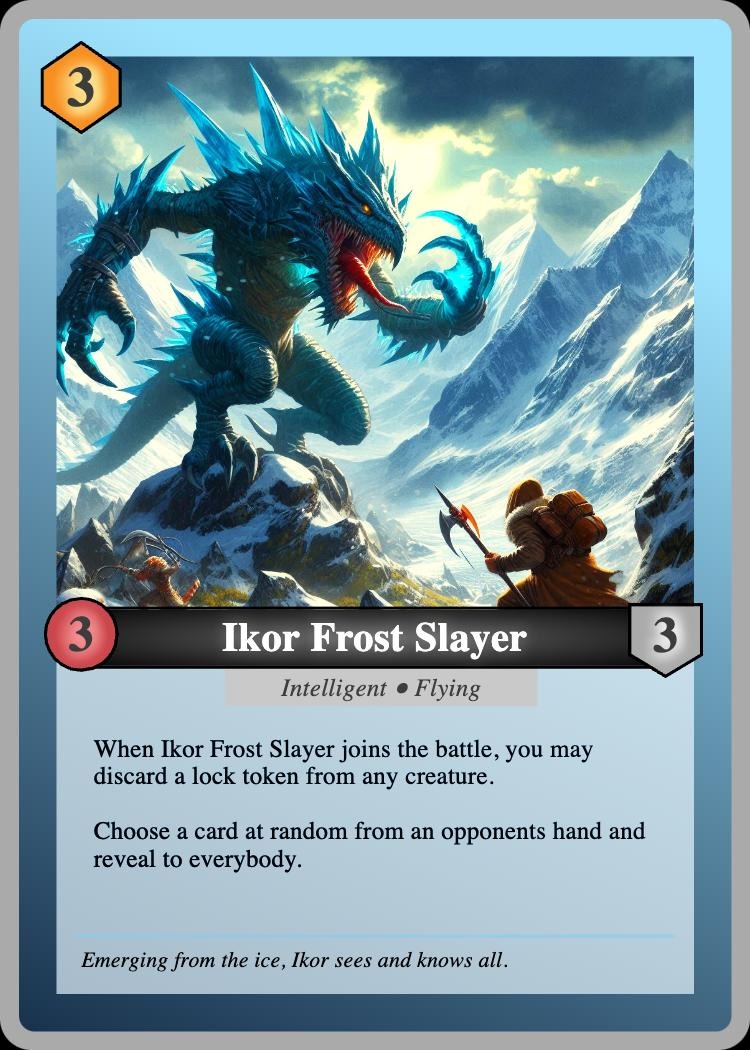
Make a new Text Zone by selecting it in the Create Zones section. Rename this zone “Abilities”. Replace the default text with something cool. I'm going with this: "When Ikor Frost Slayer joins the battle, you may discard a lock token from any creature. Choose a card at random from an opponents hand and reveal to everybody." ...but put in whatever you like ;P
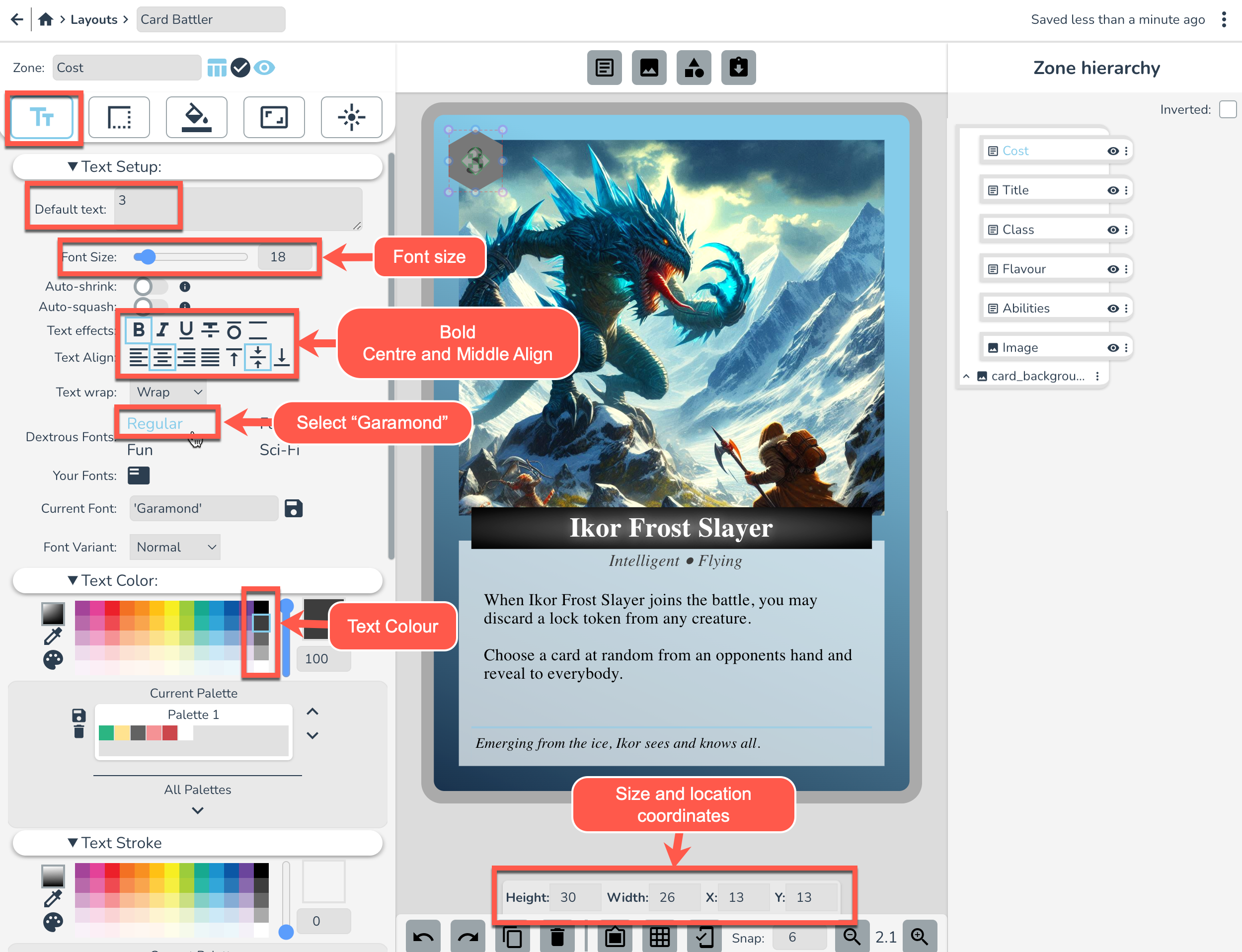
In the Text tab, set the following text settings as pictured below.
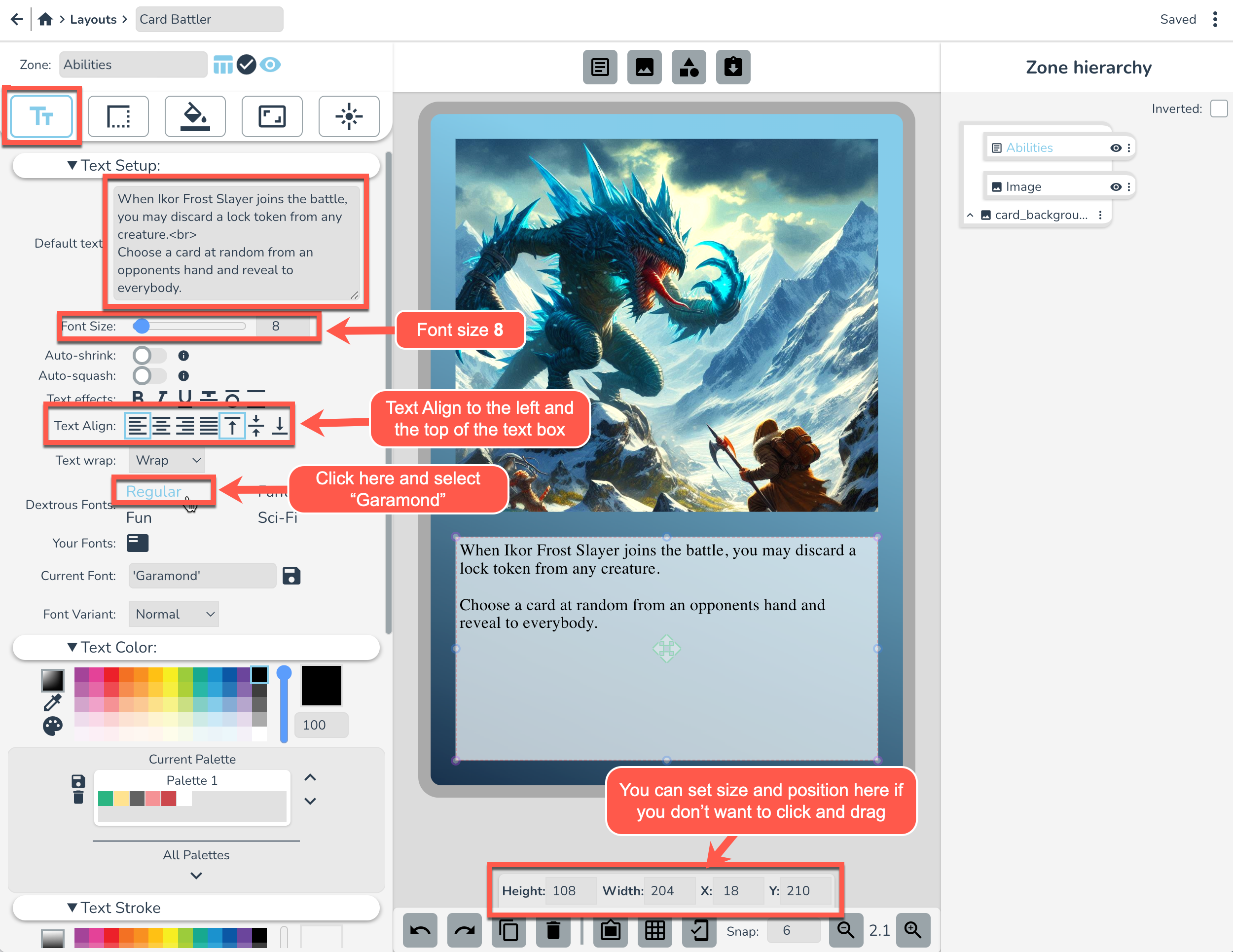
Drag and reposition this text zone into place below the Image as pictured above. I'm making it the same width as the image zone and making it start 2 snap points below the image and end 2 snap points from the edge of the card. If you want to set its size and position in the zone properties panel it would be:
- Height: 180
- Width: 204
- X: 18
- Y: 210
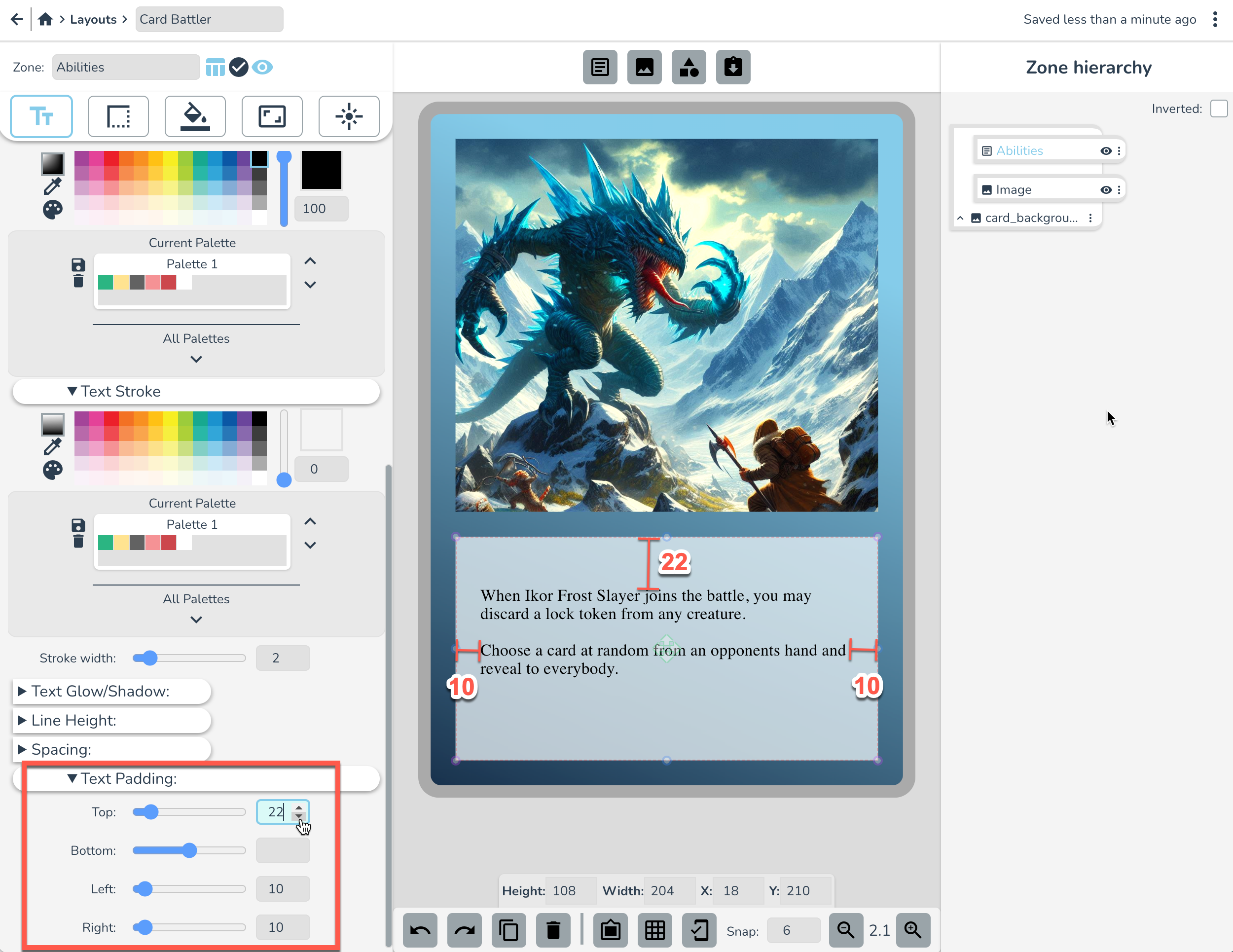
Now scroll down to Text Padding and set it to the following settings to create a nice breathing space between the text and the edge of the text zone:
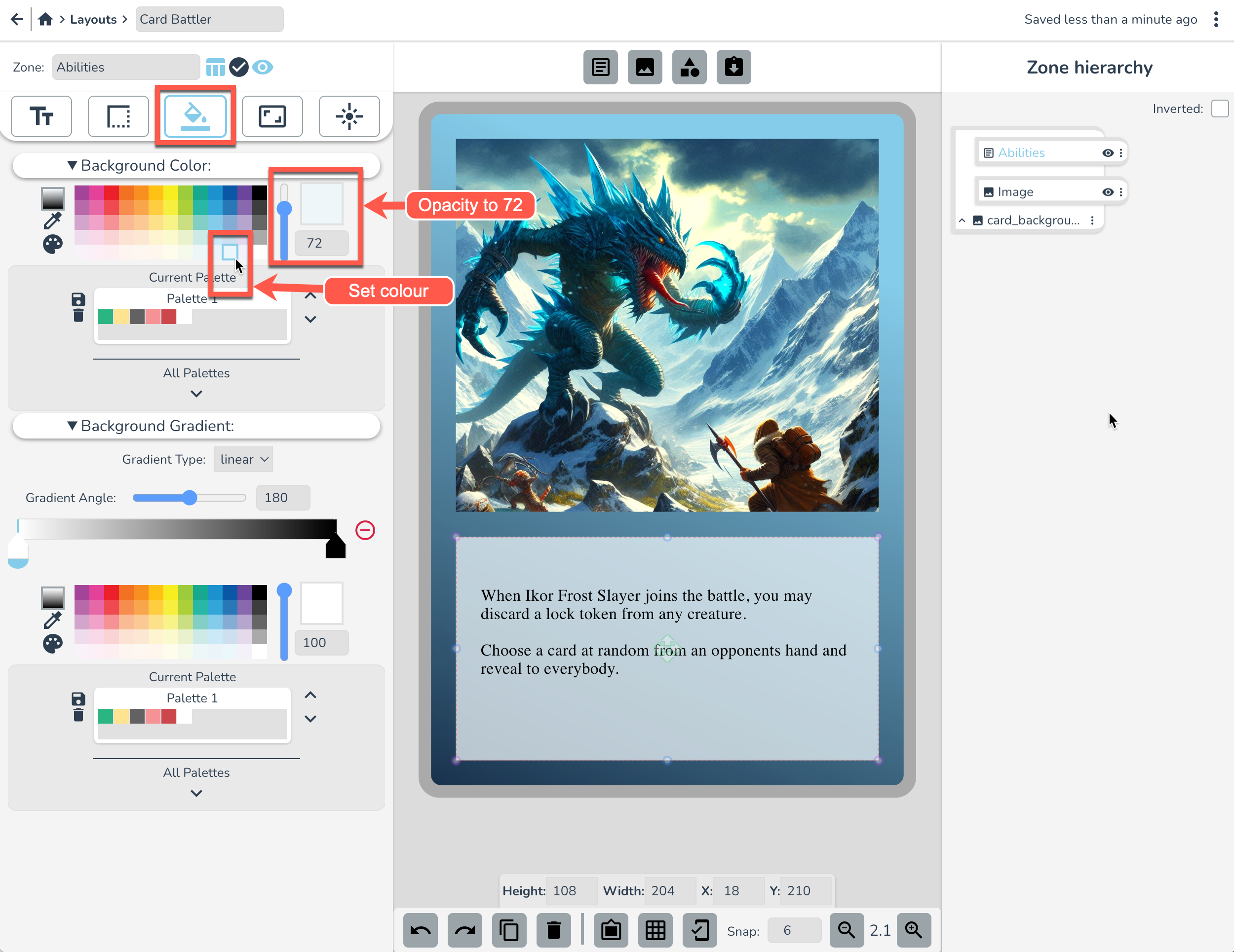
In the Background tab set the background to the settings pictured below.
There we go. We've got two important elements of the card in place.
Make the flavour text
Create a new text zone and name it “Flavor”. Replace the Default Text with something groundbreaking like, "Emerging from the ice, Ikor sees and knows all." Geddit? Groundbreaking... 😁 That's one for you Doug.
Next, click and drag the Flavour zone to the same width as the lines of ability text above it. Or apply these coordinates to it.
- Height: 17
- Width: 192
- X: 24
- Y: 300
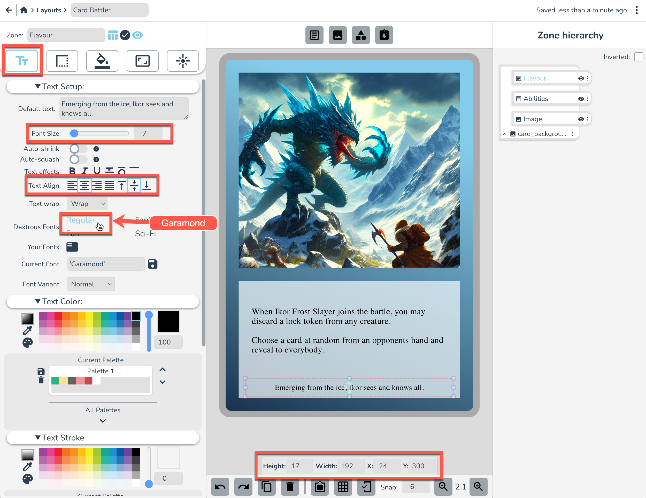
Set the font settings as pictured above, and then set these Text Padding settings just to give it a bit more vertical separation:
- Top: 4
- Bottom: 4
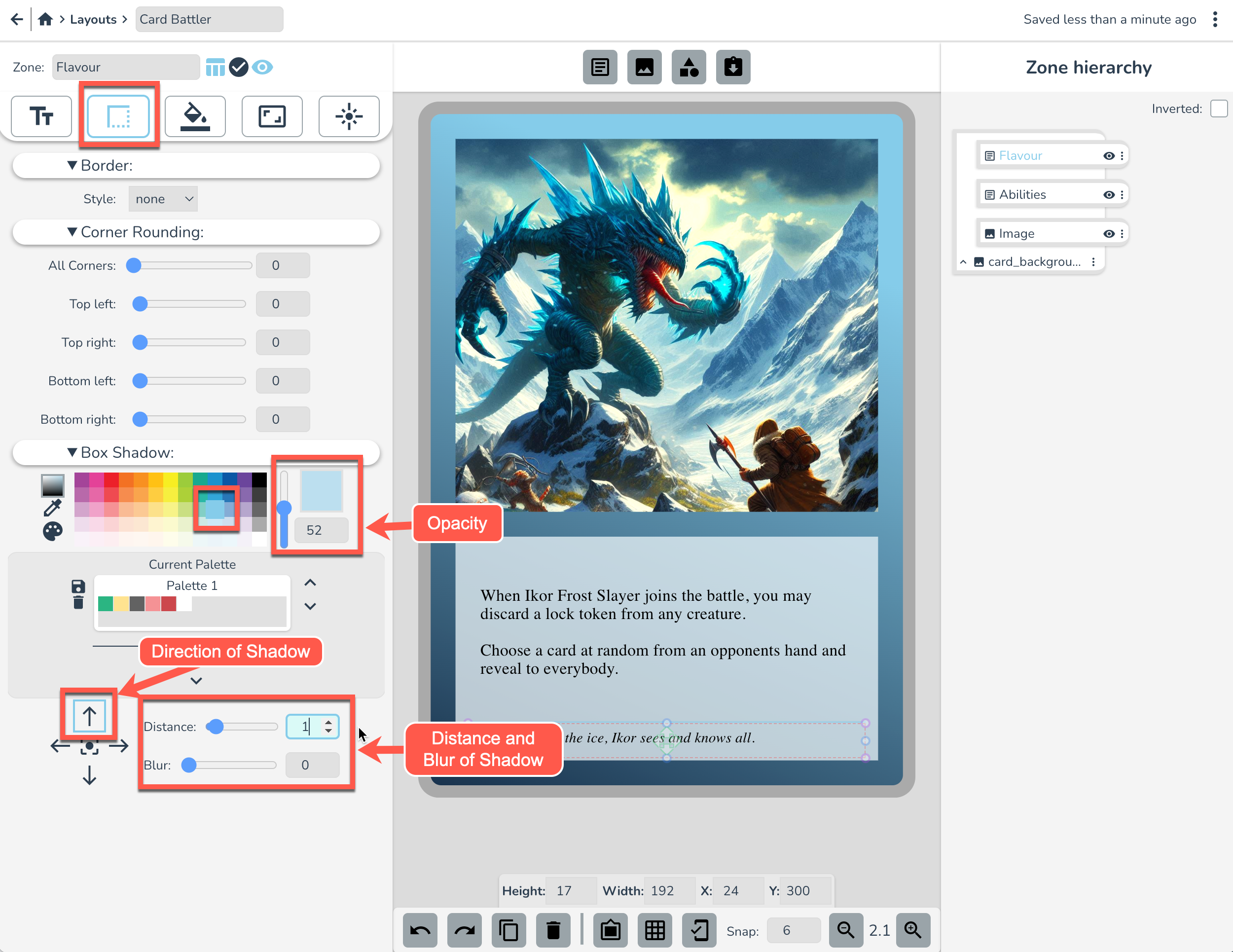
Next, in the Border Tab set Box Shadow to the below settings. This is a little trick to make a tidy line dividing the Flavour text from the abilities text above.
The Title
Create a new text zone. Rename it “Title” and replace the default text with "Ikor Frost Slayer". Resize the Title zone, and place it between the Image and Abilities zones (click and drag or set coordinates as in the pic below), then set the following font settings:
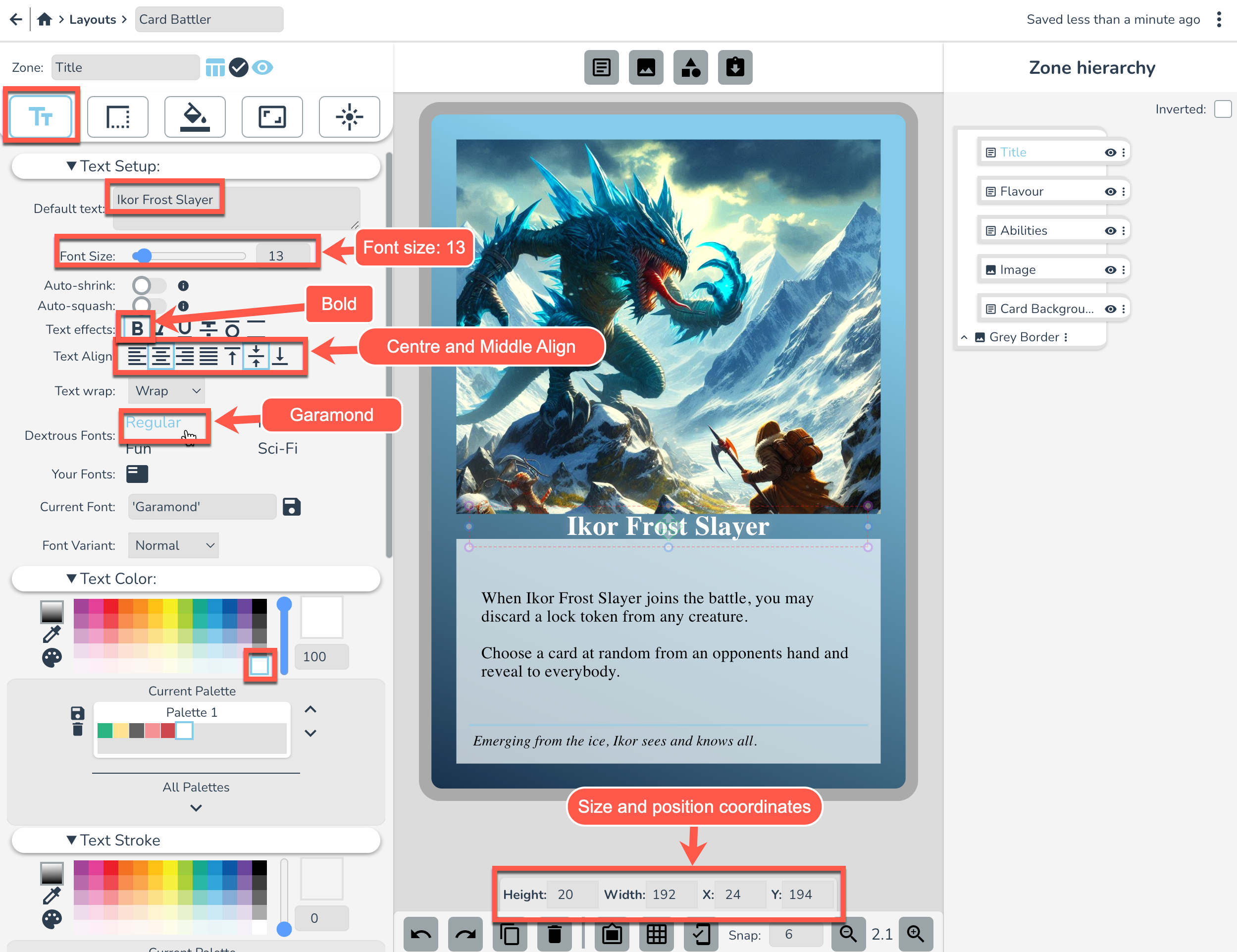
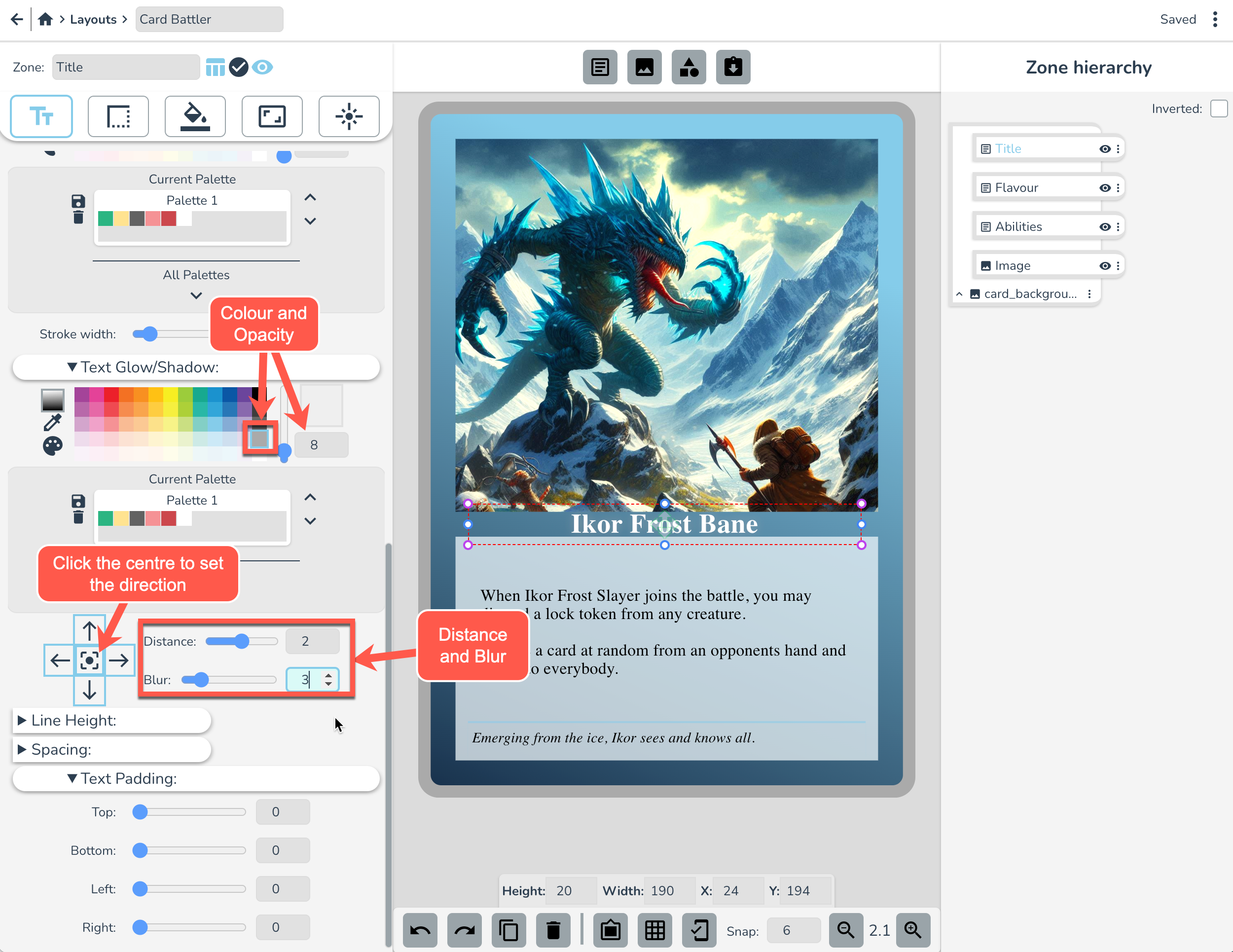
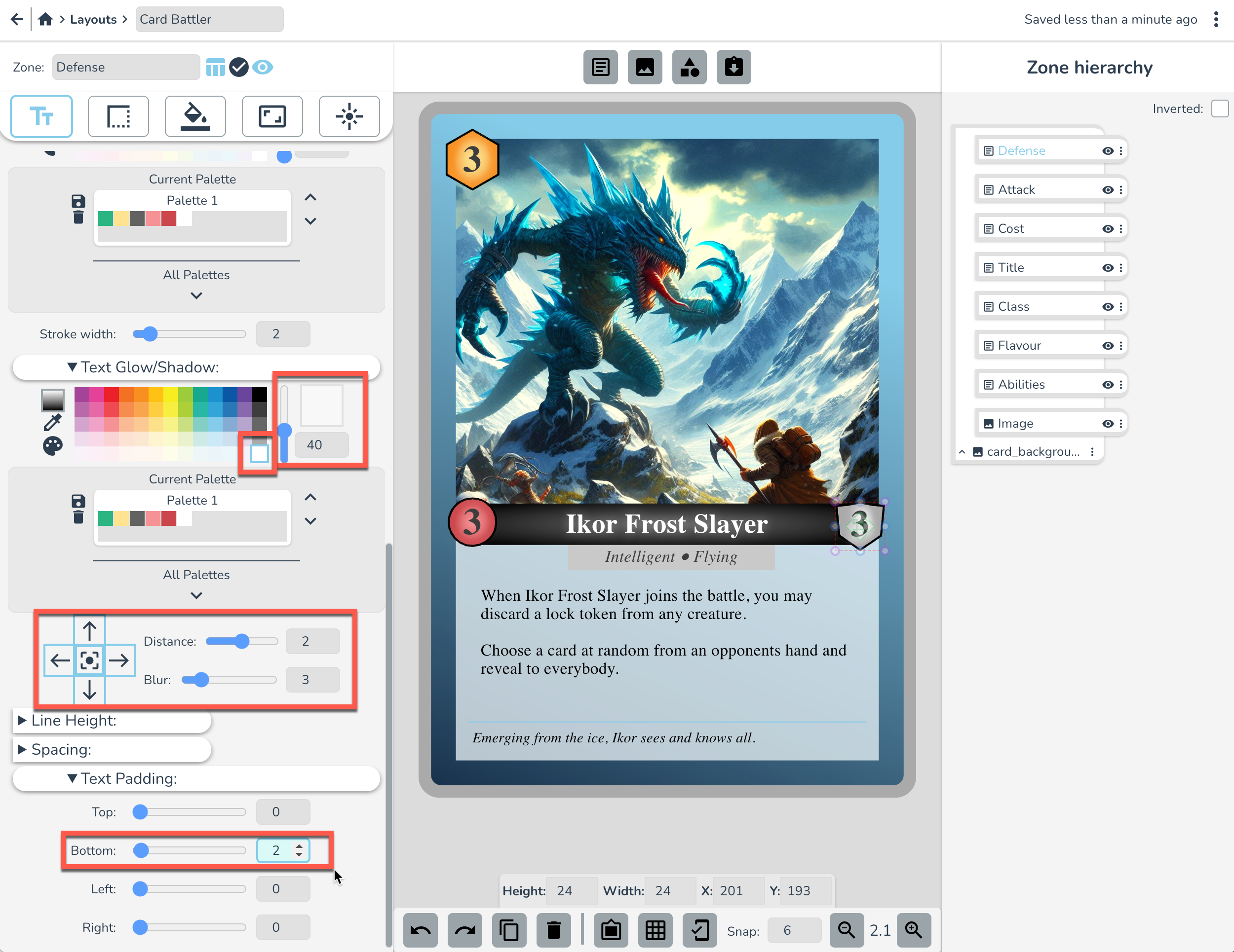
Scroll down to Text Shadow and apply the following settings. This will put a little glow behind the text. You might not be able to notice their effect yet, but it will be clearer shortly. 🧐
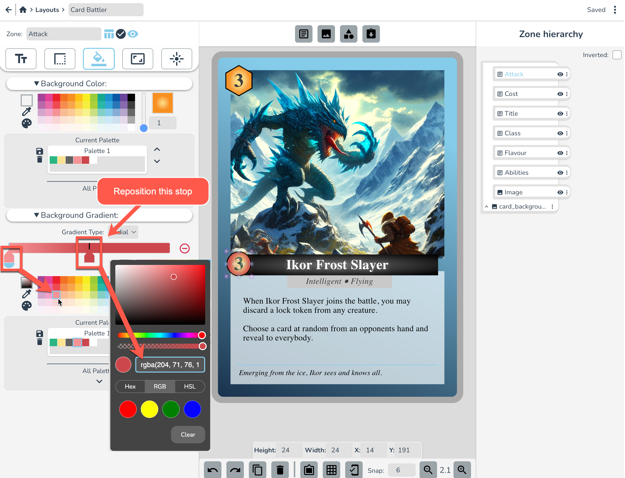
Next, head over to the Background tab. We're going to apply a dark gradient to this text box. Set the Gradient type to Radial, and the left colour stop to the colour indicated below.
Elementary, my dear Watson, but doesn't that look nice?
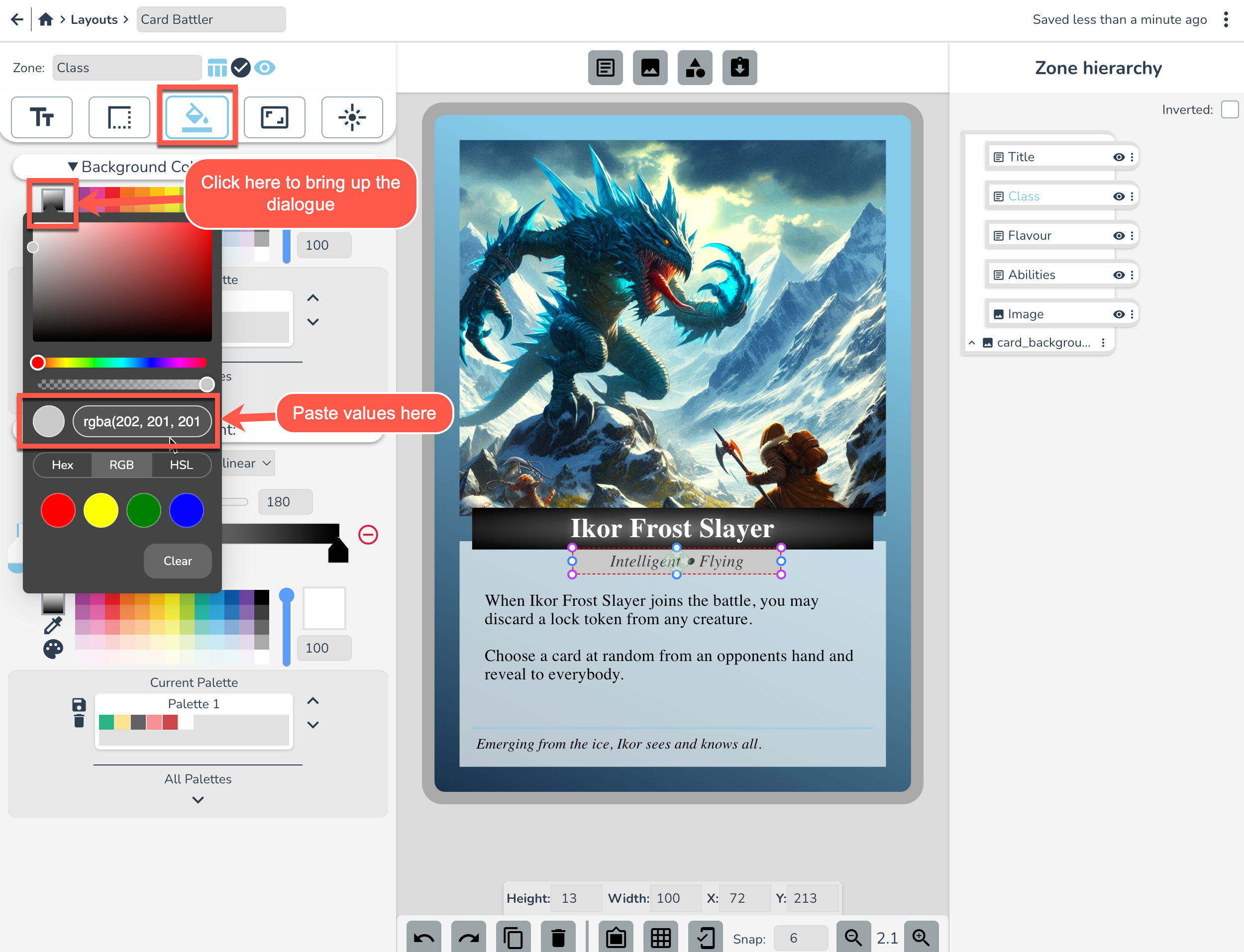
Class text box
Now let's make a class type for this creature card.
Make a new text zone and name it “Class” and replace the default text with “Intelligent ● Flying”
On the card, click and drag to place below the title. Eyeball it 🤪, or copy the coordinates from below. Don't forget to set the font settings too!
We want the Class zone to tuck in under the title. To do this, go to the hierarchy panel on the right and click and drag “Class” zone so it is below “Title”. Note that anything above something else in the hierarchy panel will appear above it on the card canvas (higher z-index).
Now let's give this Class zone a silvery-grey background. Set the background colour by double clicking on the Colour Picker to open the dialogue and then paste in the RGB Values: rgba(202, 201, 201, 1)
Ok that's looking half decent. 👔
Cost Icon
Make a new Text zone with a hexagon-side clip path shape. Name it “Cost” and replace the default text with “3”.
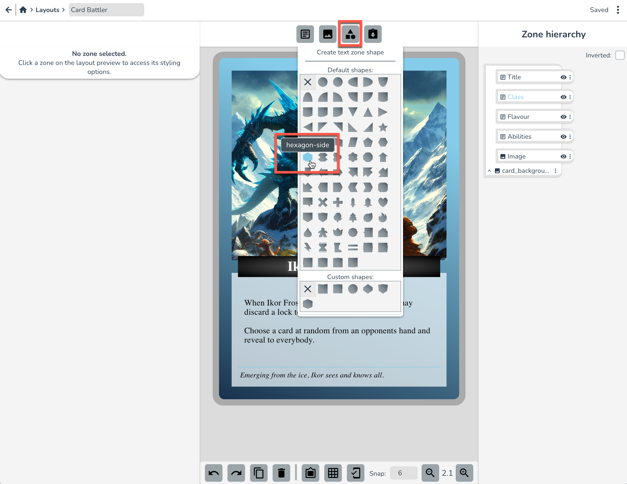
Resize this zone and place at the top left of the card (or copy in coordinates from screenshot below). Tip: A shape zone is just a normal text zone with a clip-path shape applied already. You can change the clip-path shape in the positioning tab later if you want.
Now we've got our shape in position, let's set up the font settings:
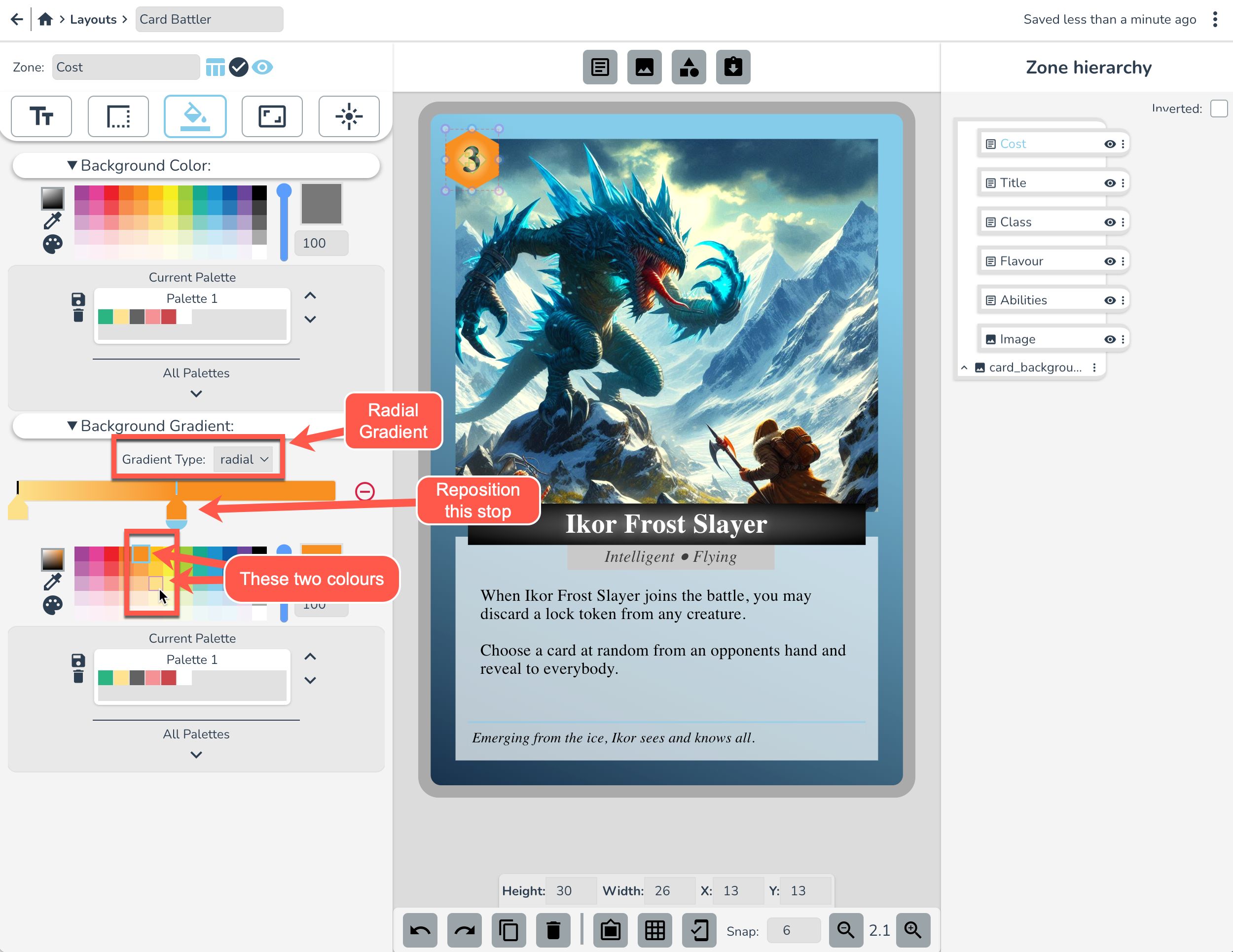
Now let's get a nice looking background on this cost icon. In the Background tab, setup a nice orange gradient like this:
In the Border Tab set the following Border settings:
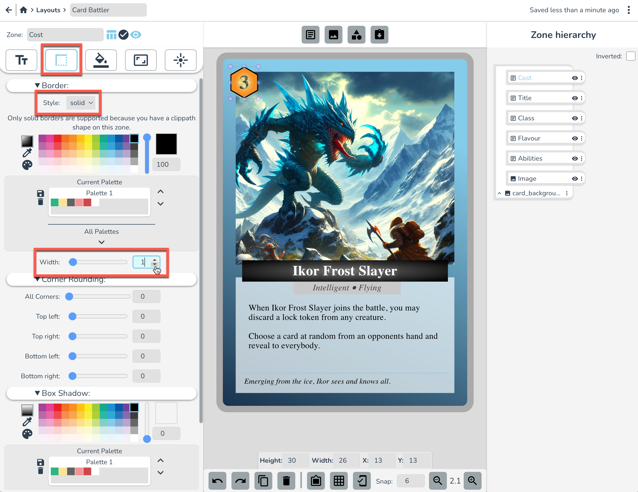
🎵 Whoa Black Border, bam-ba-lam! 🎵
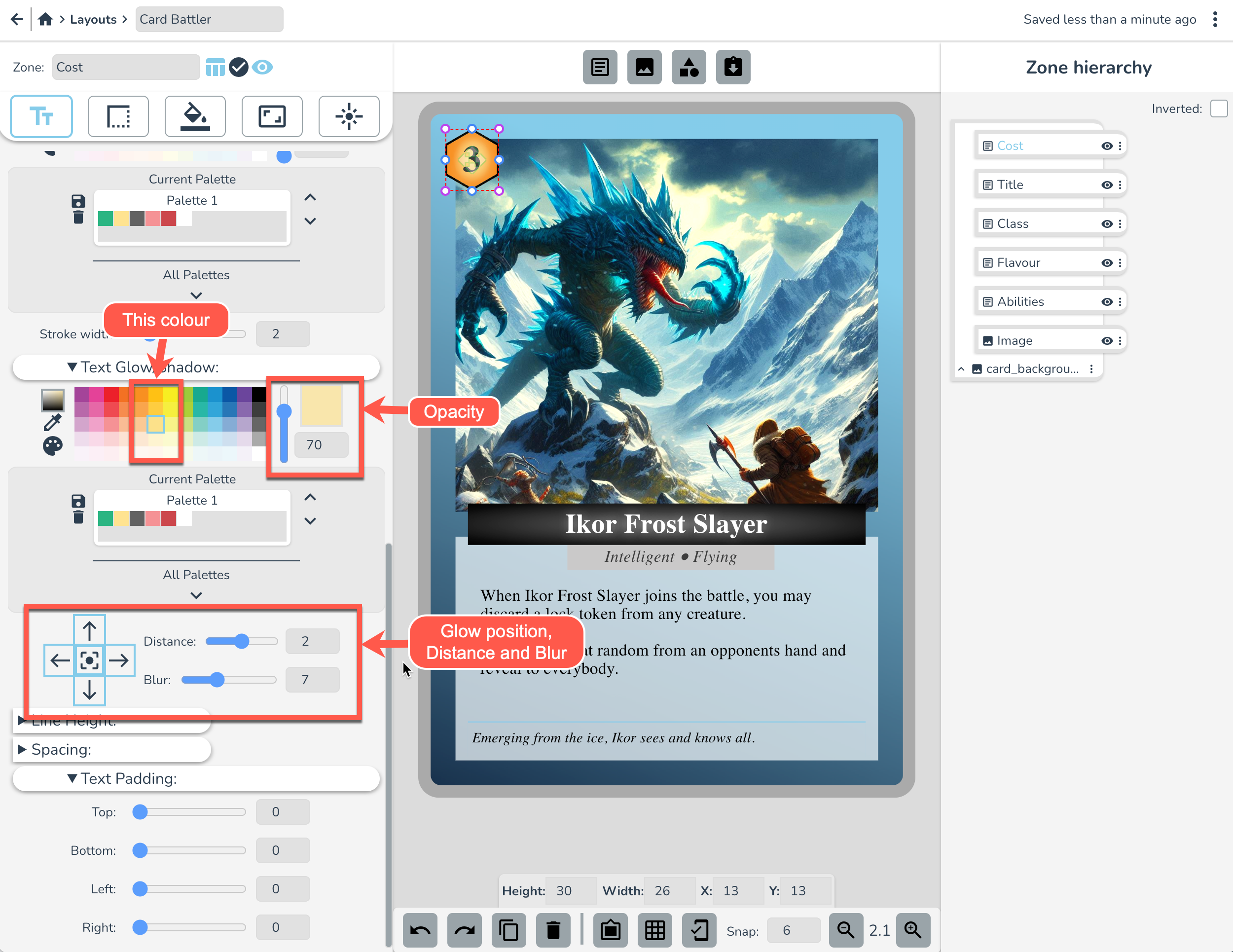
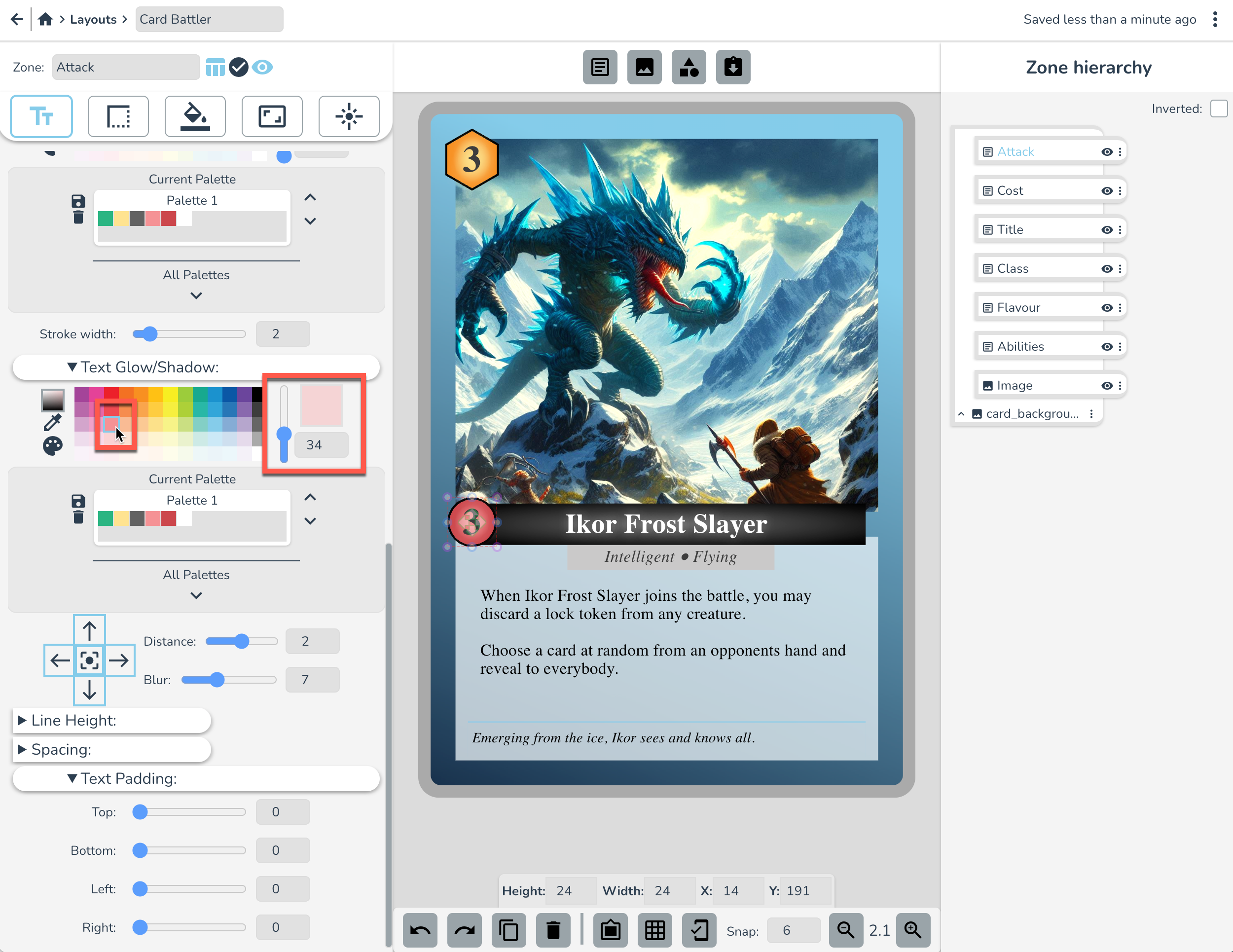
Head back over to the Text settings tab and set these Text Glow settings to make the text pop a little more.
Attack Icon
Ok we're going to make another icon, but this time we won't make it from scratch. We'll use the cost icon as a starting point. Duplicate the Cost Icon zone by selecting it and hitting ctrl+d or using the duplicate icon button at the bottom of screen.
Rename the zone “Attack” and reposition it to the left of the title.
In the Position tab, select “Polygon Circle” from the default Clip Path shapes. Alternatively we could go to it's border settings and just round the corners.
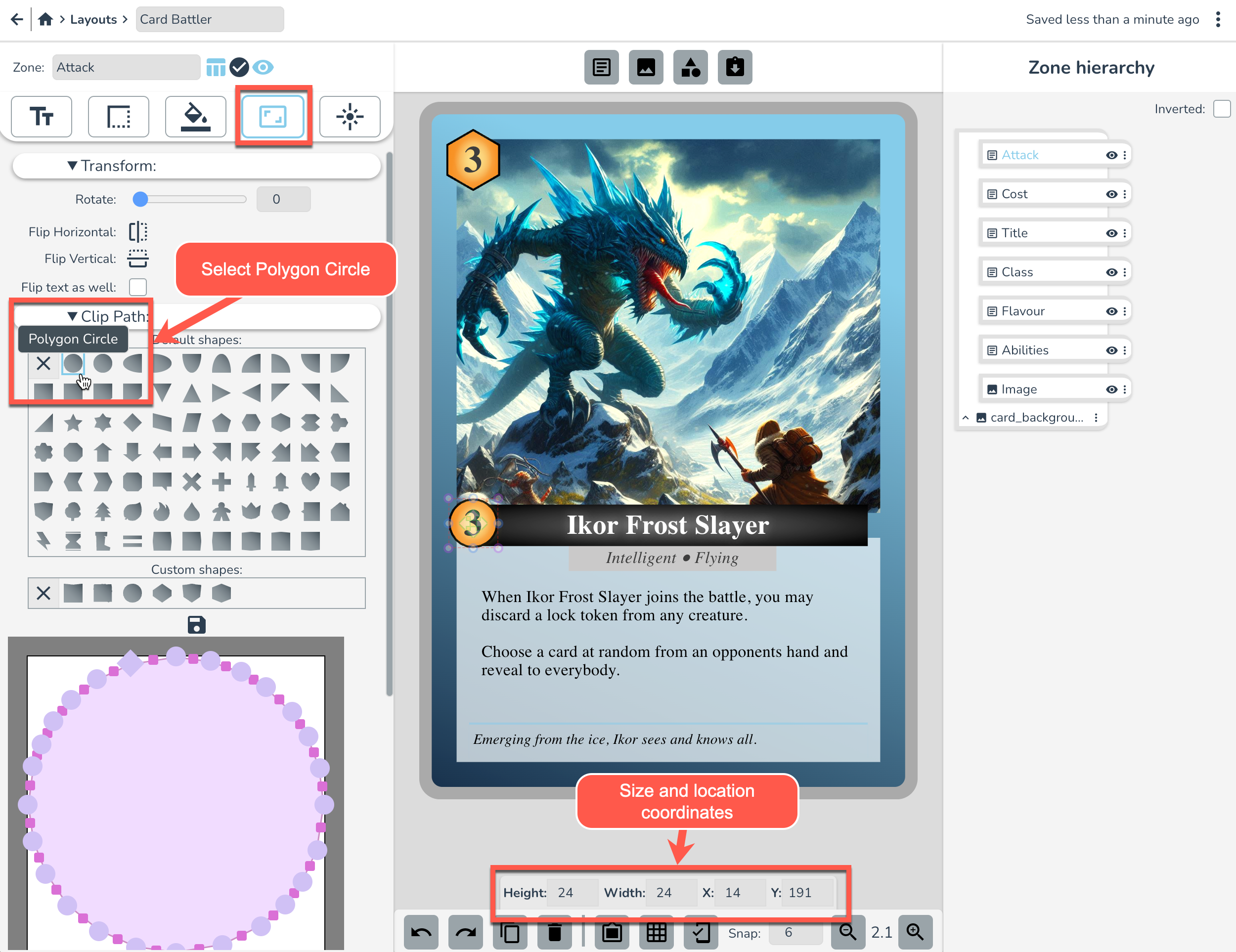
Next, in the Background Tab, set the below gradient settings to get a nice red 'attacky' color.
Over in the Text Tab, set the Text Glow/Shadow settings as below
The Defense Icon
Time for one more icon! Duplicate the Attack Icon this time (ctrl+d), rename it “Defense”, and reposition it to the Right of the title.
In the Position tab, select “Shield 2” from the default Clip Path shapes:
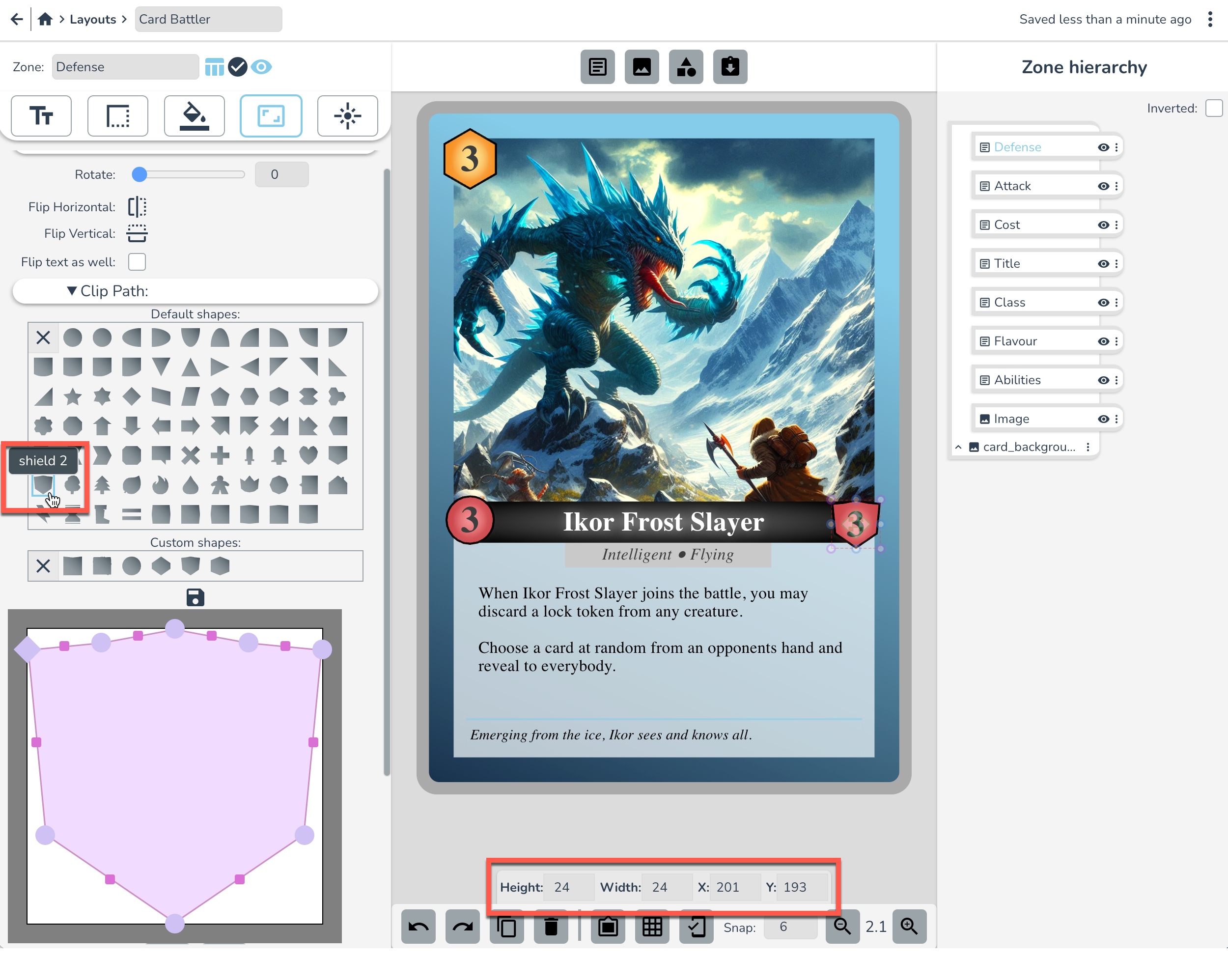
In the Background Tab, set the background colour indicated below. Note that this grey background color takes precedent over the gradient (whichever one you set last overrides the other).
Over in the Text Tab, set the Text Glow/Shadow and Padding settings as below:
...And that's it!
The card fronts are done!
Good job you. Just like that, you've learned the basics of the Dextrous layout editor and you have a new creature battler layout template ready for use in your next board game or card game project!
In the next Design tutorial (coming soon!) we'll show you how to give your cards a more professional look as well as how to set the backs of the cards for your own custom deck.
In the meantime, if you want to learn how to make cards from this layout, head to the tutorials page and check out and try this tutorial next. Don't worry, you've already done the hard part!
If you're curious though, I've included a little explanation below on why we're making cards in layouts like this...
Why is Dextrous the Best Online Card Game Design Tool?
At Dextrous, we are all about a faster game design loop, because we believe a game on the table is worth two in the brain!
Using a tool like Photoshop, you have to make each card by hand, one card at a time. Using Dextrous, you can design a layout for a custom card and then apply this template to your whole game deck. So that layout you just made? You can apply that to 100s of cards and just change the bits that are different across different cards (like atk, def values etc.).
This is why more and more board game designers are using Dextrous to design and print custom game cards for their tabletop games. It's simply the fastest online card maker around. And the best part is, once you've got cards made in Dextrous, if you decide to change something about the design, you can just go to the layout, make the change, and voila! The change is reflected on every card in your card deck.
Whether you're designing your own custom playing cards, or you want to make cards for a unique pnp that people can print at home or at the print shop, Dextrous has got you covered. We have a ton of different default card dimensions to choose from including regular playing cards sizes like Poker or Bridge, as well as Tarot cards, Business cards, and Square cards. On the other hand, we try to give you the flexibility to do designs the way you want, so if you want to customise the exact size of a component or you want to create a unique shape for a token you can do that too.
Make your cards using Dextrous, print your cards at home or at a print shop, cut out the cards with a paper cutter and boom, your idea is out of your head, and onto the table.
Print your cards
Speaking of getting your cards onto the table. How would you get these card fronts printed at home?
For a custom made prototype, I'd recommend one of these options:
- Printing on A4 cardstock, then using a guillotine cutter (not amazing for shuffling, but cheap and quick)
- You can also print on label paper (laser printer recommended)
- Alternatively, if you only care about the front of the card, you can print on regular paper or card stock and then put them in card sleeves (one classic trick is to use an old mtg card in the sleeve to give it thickness).
So you've got a few great options there, but your next step is to learn how to use the component editor to make a deck of cards from this layout. We'd recommend you check out the tutorials page and try this tutorial next.